One of the ways we used the technologies to offer was for our planning and research. Through the computers we found it was a much easier way to keep in touch to other members of the group through email and social network sites. This allowed us to work outside the restraints of a classroom and keep in contact almost 24/7. Another way we used the computers in a way where we could work outside the classroom is through the use of this blog. This allowed us to work in different places for whatever reasons. It also allowed us to be more creative with our work as we can reference music videos and other content on the blog which is only a click away.
The computers and Apple Macs were hugely important when it came to the research and planning stages of the course. It allowed us to use the internet too look at a vast amount of resources, such as existing music videos, music posters, album covers and different opinions on what people thought the song "Close to Me" actually meant, in terms of lyrics and hidden meanings. For the planning of our music video we had lots of material to view on the internet for inspiration and ideas which we then would try and feature in our music video.
The main way we as group would say we used media technologies would be in the production stage of the project. For the production of our products (music video, album artwork and poster) we used a variety of different applications on the Apple Macs such as Photoshop and Final Cut Pro. For our digipack we used Photoshop to edit the photos to create this black and white look, this fits into our house style which we chose from the beginning. For the poster we had the challenge as two of us were going to be in the photo and the other two group members were unavailable of taking two separate photos of Paige and Tom, then making it look like it was one original photo. We used a tool called "rubber stamp" on Photoshop to make the brickwork at the back match up on the two photos.
We used technology in our music video production in the form of FCP (Final Cut Pro) which is a editing application. For some of us in our group this was our first experience with any editing programme but we feel we all contributed and picked up the techniques to use it. We all contributed our own ideas for the music video. One of the things we used on for our music video is this idea of 4 screens showing all of the band sleeping on screen at once, we done this by layering and resizing each image and playing them together side by side by side on screen. Another major aspect into what made our video what it is, is the use of effects on our video. We added this "sepia" look to the whole image which we felt made it look older, as the 80's style was what we were going for. At some points we used a different effect called "bad film" this gave the image a grainy look like a old film, we reference this and the ending where it says "fin" to cinema verite. Cinema verite is referenced as this handheld documentary style, which was something we was aiming for when we said we wanted our music video was to look home made.
We also used the FCP for simple editing task such as trimming different videos and cutting them together to make the final piece. We also added the music to the video on here. We shortened the track as there was a lot of instrumental towards the end of the song which we felt we didn't need we did this by adding fade out to the track. We also feature another fade on the image as it moves to the shot in the dark, we did this as we felt it made the transition look smoother, we used this technique for the end of the music video aswell.
Overall we have used many different technologies in our music video which we feel have contributed massively to the end product, without the help of these technologies what we have created now would never have been possible.
 Below you can see our album cover which we designed. The first picture is the front cover and the second picture is the back of the album. As you can see we stuck with the theme of black and white. The album title is "Head On The Door" so we stuck with a meaningful album cover of having one of the band members looking through the key hole. This in its self has a meaning of looking into the unknown and mystery, not knowing what you will find on the other side. This sticks with The Cures genre of music as it is sometimes referred to as quite fantastical so the idea of the unknown on the other side of the door fits well.

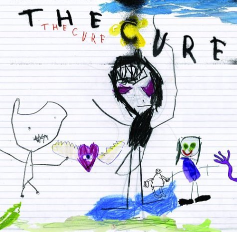
 This is the back cover of the inside leaflet. Here we simply wrote down the track names, rather scruffily. This is almost a homage to the original artwork from The Cure, where it simply consists of sketches and scribbles upon a page. The idea of this track list was supposed to look like a set list as in what the band would use during a gig to know what song they are doing. This fits with our music video itself as the original idea was we would be getting ready before a set on "Top of the Pops"


